안녕하세요. 스타입니다.
html5 및 CSS 2일차 강좌입니다.
온라인으로 CSS를 테스트 할 수 있는 페이지
- 헤일로 효과 적용한 태양 그리기.
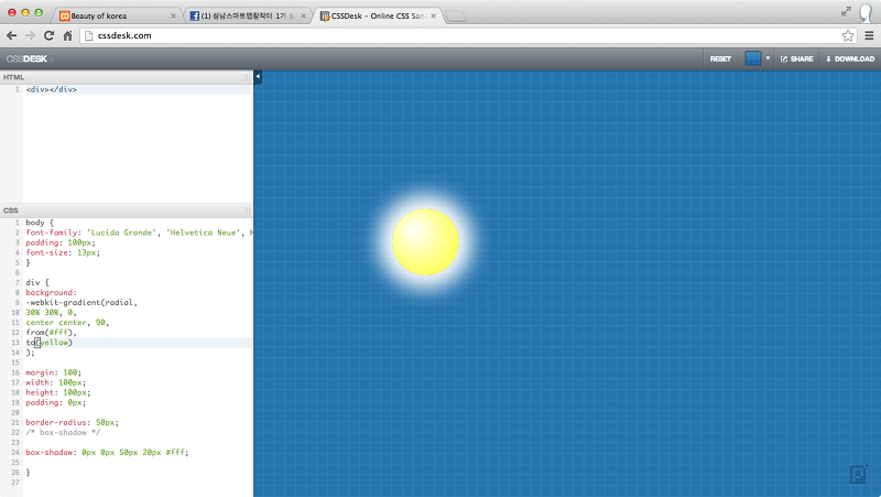
CSS
body {
font-family: 'Lucida Grande', 'Helvetica Neue', Helvetica, Arial, sans-serif;
padding: 100px;
font-size: 13px;
}

div {
background:
-webkit-gradient(radial,
30% 30%, 0,
center center, 90,
from(#fff),
to(yellow)
);

margin: 100;
width: 100px;
height: 100px;
padding: 0px;

border-radius: 50px;
/* box-shadow */

box-shadow: 0px 0px 50px 20px #fff;

}
- 폴라로이드 스타일
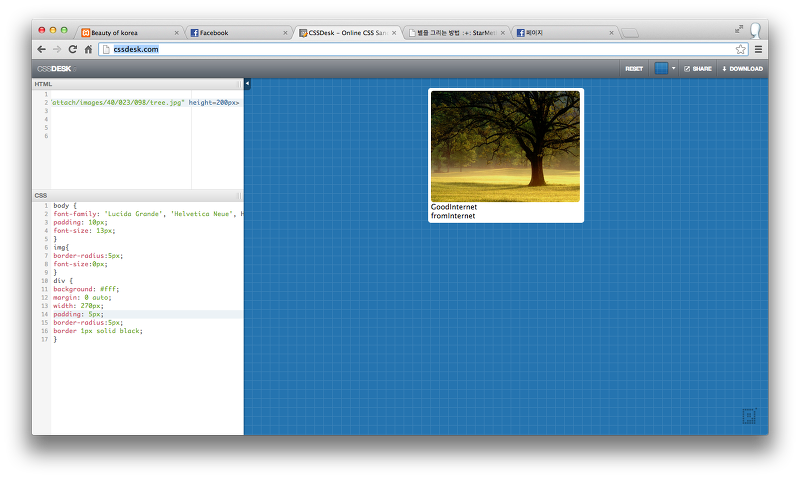
HTML
<div>
<img src="http://www.bayalpineclub.com/files/attach/images/40/023/098/tree.jpg" height=200px>
<figcaption>
GoodInternet<br>fromInternet
</figcaption>
</div>
CSS
body {
font-family: 'Lucida Grande', 'Helvetica Neue', Helvetica, Arial, sans-serif;
padding: 10px;
font-size: 13px;
}
img{
border-radius:5px;
font-size:0px;
}
div {
background: #fff;
margin: 0 auto;
width: 270px;
padding: 5px;
border-radius:5px;
border 1px solid black;
}
- 구조적으로 CSS 만들기
- gradient button and over
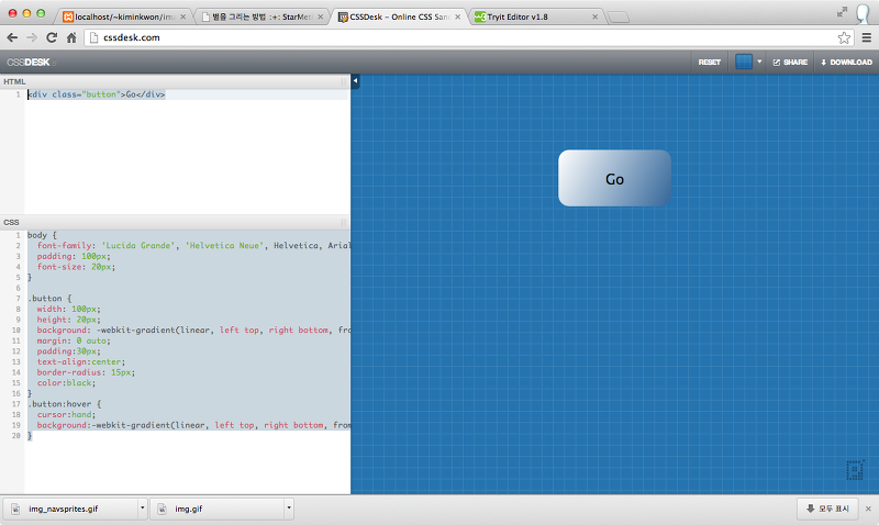
HTML
<div class="button">Go</div>CSS
body {
  font-family: 'Lucida Grande', 'Helvetica Neue', Helvetica, Arial, sans-serif;
  padding: 100px;
  font-size: 20px;
}

.button {
  width: 100px;
  height: 20px;
  background: -webkit-gradient(linear, left top, right bottom, from(#fff), to(#369));
  margin: 0 auto;
  padding:30px;
  text-align:center;
  border-radius: 15px;
  color:black;
}
.button:hover {
  cursor:hand;
  background:-webkit-gradient(linear, left top, right bottom, from(#369), to(#fff));
}
- imagesprite
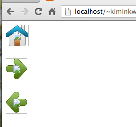

<!DOCTYPE html>
<html>
<head>
<style>
img.home
{
width:46px;
height:44px;
background:url(img_navsprites.gif) 0 0;
}
img.next
{
width:43px;
height:44px;
background:url(img_navsprites.gif) -91px 0;
}
img.prev
{
width:43px;
height:44px;
background:url(img_navsprites.gif) -47px 0;
}

</style>
</head>

<body>
<img class="home" src="img_trans.gif" width="1" height="1" />
<br><br>
<img class="next" src="img_trans.gif" width="1" height="1" />
<br><br>
<img class="prev" src="img_trans.gif" width="1" height="1" />
</body>
</html>